
The Urban Sketchbook: Intentional Color in the Art of Reduction
If The Art of Reduction is my core compositional philosophy, then urban sketching provides the perfect arena to practice it with both line and color. Where photography forces me to selectively eliminate distractions after the fact, the sketchbook starts with a blank page and requires me to add things to it. Because quick sketches must be focused, this medium forces me to reduce a complex scene to its essential elements, lines, and planes of color.
I find that many clients, when faced with the sensory overload of a beautiful place like Amsterdam, succumb to the Paralysis of Choice. In their desire to document everything—every flower, every window pane, every passing boat—they end up documenting nothing of true artistic substance. The solution, applied in The Focus-First Method, is to Pause and decide what is necessary, accepting that whatever is created is a subjective representation of experience, not the reality itself.
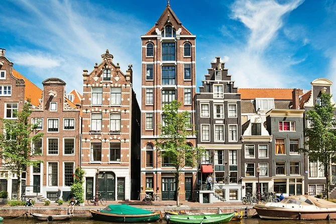
For example, these boats. Especially the ones with tarps on them. If the focus is on the buildings, let’s get rid of them.
1. The First Reduction: Line, Shape, and Negative Space
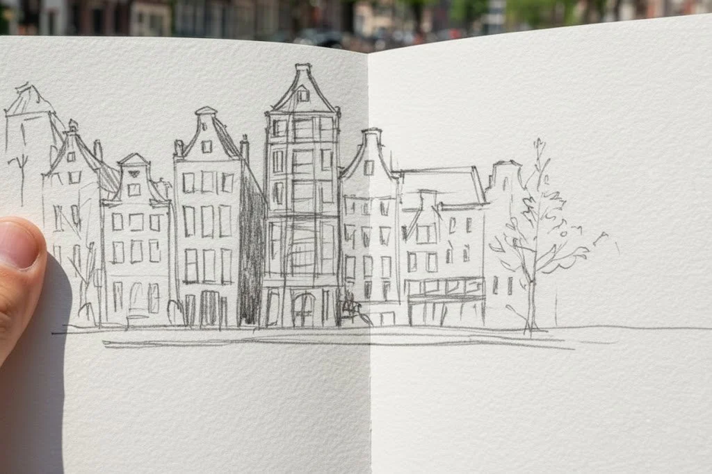
And while we’re simplifying, let’s reduce the details on these buildings and not worry about every leaf on the trees. In fact, for the sake of making a point, let’s simplify the stepped gables of that roofline and change some doors around. We’re making art here.
Before any color is introduced, the most effective way I overcome a cluttered scene is through the line sketch. This is the first, most fundamental act of reduction. I teach my clients to quickly identify the primary masses and negative spaces, deliberately eliminating visual distractions.
In this Amsterdam canal scene, for example, I see overwhelming detail: dozens of bricks, countless windows, and boats cluttering the foreground. My first compositional task is to remove the elements that do not serve the story of light and architecture.
I make the deliberate decision to remove the boats from the foreground. Why? Because the boats demand too much attention and distract from the beautiful geometry of the houses and the gentle curve of the bridge. The sketch becomes immediately cleaner and more focused, creating a purity of vision through the simplest of means—the pencil line.
2. The Second Reduction: The Philosophy of Intentional Color
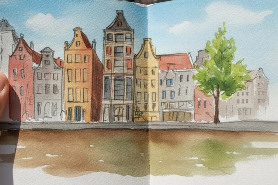
Here we go. Mood, scene, and experience represented. Enough details to capture the specific time and place, simplified to make it achievable. You’ll notice that the two other trees exist now only as faint pencil lines, and one of the buildings on the right is gone. They would have unnecessarily obscured or complicated things. Remember, our goal is not to create a photograph of what is, but to represent an experience.
Once the line sketch provides a stable foundation, I introduce color, but I do so with immense discipline. Color, in sketching, is often the greatest distractor; it's easy to render a scene accurately but artistically mute. I urge my clients to use color intentionally, not realistically.
My goal is not to match the exact shade of every roof tile. My goal is to capture the feeling of the scene. I achieve this by simplifying the palette, choosing a limited set of colors that describe the mood of the light.
• Color as Temperature: I use a warm ochre to establish the sunlight hitting the facades and a cool, diluted blue for the shadows and water. I also simplify the sky from a complex cloud pattern to a clean wash that supports the light, removing the distracting visual noise that complex cloud shapes would create.
• Color as Accent: I will often reserve the brightest, most saturated color (perhaps a strong red or green) for one small area—a bicycle, a flower box, or in this case, the foliage of the tree—to draw the eye precisely where I want the viewer to look. This single stroke of vivid color acts as a compositional anchor.
This selective application of color forces me to focus only on the essential relationships between light and shadow. It is a direct parallel to how I approach my photographic work, ensuring that every mark, every wash, is a conscious, artistic choice.
Conclusion: Creating Tangible Memories with a Brush

Before and After. Photoshopped composite of preceding images.
Whether I am teaching a client to frame a shot on their camera or instructing them on the precise application of a watercolor wash, the underlying philosophy is the same: True mastery is found in focus, often enhanced by what you choose to leave out. By applying The Necessary Pause and embracing The Art of Reduction in your urban sketchbook, you stop being a passive recorder and become an active interpreter. The resulting image—be it a photograph or a quick sketch—is not just a souvenir; it is a profound, intentional, and Tangible Memory.
If you are ready to master the essential creative skills that transform sightseeing into artistry, I invite you to explore my Sketching Tours in Amsterdam.